January 27, 2026
How to Choose Wedding Flower Colors That Actually Work Together
A practical guide to choosing your wedding bouquet color palette. Learn which flower colors complement each other and how to match your wedding theme.

Choosing wedding flower colors should be one of the fun parts of planning. Instead, it sends many brides into a spiral of Pinterest boards, paint swatches, and paralysis. The problem is not a lack of options — it is too many options with no clear framework for narrowing them down.
This guide gives you a practical, step-by-step method for choosing a wedding flower color palette that looks cohesive in person, photographs beautifully, and works with everything else in your wedding design.
How Many Colors Should a Wedding Bouquet Have?
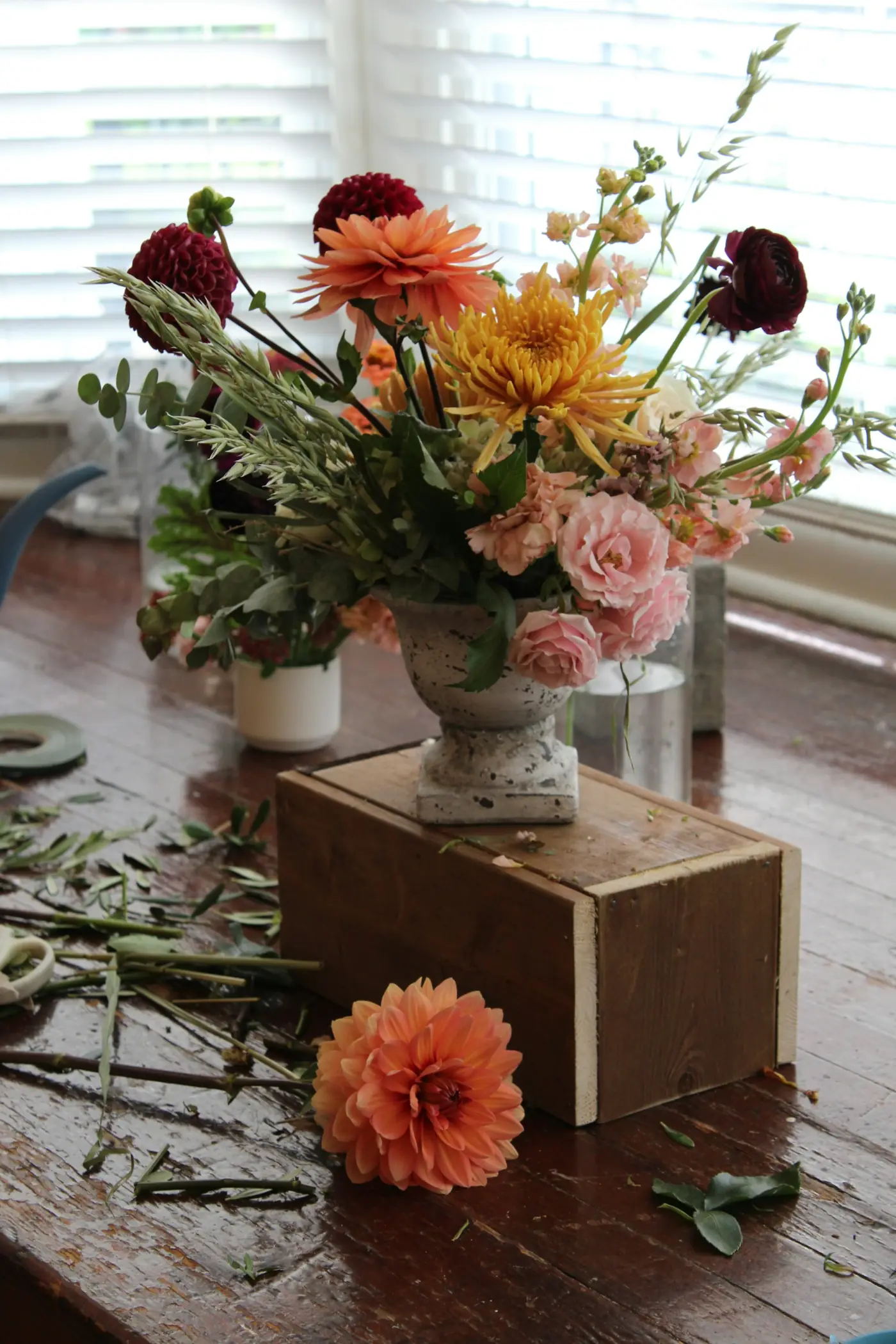
The answer is simpler than you think: two. One primary color and one secondary (accent) color. This is the formula professional floral designers use because it works every time.
Your primary color is the dominant tone — the one that makes up roughly 60% to 70% of the bouquet. Your secondary color is the accent that adds depth and interest, making up the remaining 30% to 40%.
Greenery counts as a neutral in this system, not as one of your two colors. So a bouquet with white roses, dusty blue delphinium, and eucalyptus is a two-color bouquet (white + dusty blue), not three.
Why two colors works:
- It looks intentional, not random
- It is easier (and cheaper) to source flowers in two colors than five
- It photographs cleanly — no muddy, confusing color masses in your pictures
- It creates visual harmony without being boring
Can you use three or more colors? You can, but each additional color increases the complexity and the risk of the palette feeling scattered. If you go beyond two, make sure the additional colors are closely related (different shades of the same hue, for example).
How Do You Pick Your Primary Bouquet Color?
Start with what is already decided. Your primary bouquet color should connect to at least one of these:
Your wedding palette. If you have already chosen wedding colors for bridesmaids' dresses, linens, or invitations, your bouquet should complement that palette. The bouquet does not need to match exactly — in fact, a slight variation is more visually interesting — but it should feel like part of the same family.
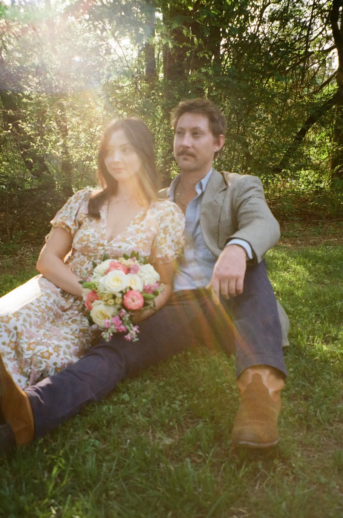
Your dress. If your dress is bright white, cool-toned flowers (white, lavender, dusty blue) will harmonize naturally. If your dress is ivory or champagne, warm-toned flowers (blush, peach, cream) will look more cohesive. Pairing a warm ivory dress with stark white flowers can create an unintentional contrast where the dress looks dingy.
Your venue. Dark, moody venues (exposed brick, dark wood) can handle rich, saturated bouquet colors. Light, airy venues (white walls, natural light) look best with soft, lighter tones. Outdoor venues with lots of greenery give you flexibility, but earthy, organic tones tend to blend most naturally.
At Wedding Box Florals, our two primary color options are pink and white. These serve as the foundation for nearly every wedding palette because they complement the widest range of dress colors, venue styles, and secondary accents.
How Do You Choose a Secondary (Accent) Color?
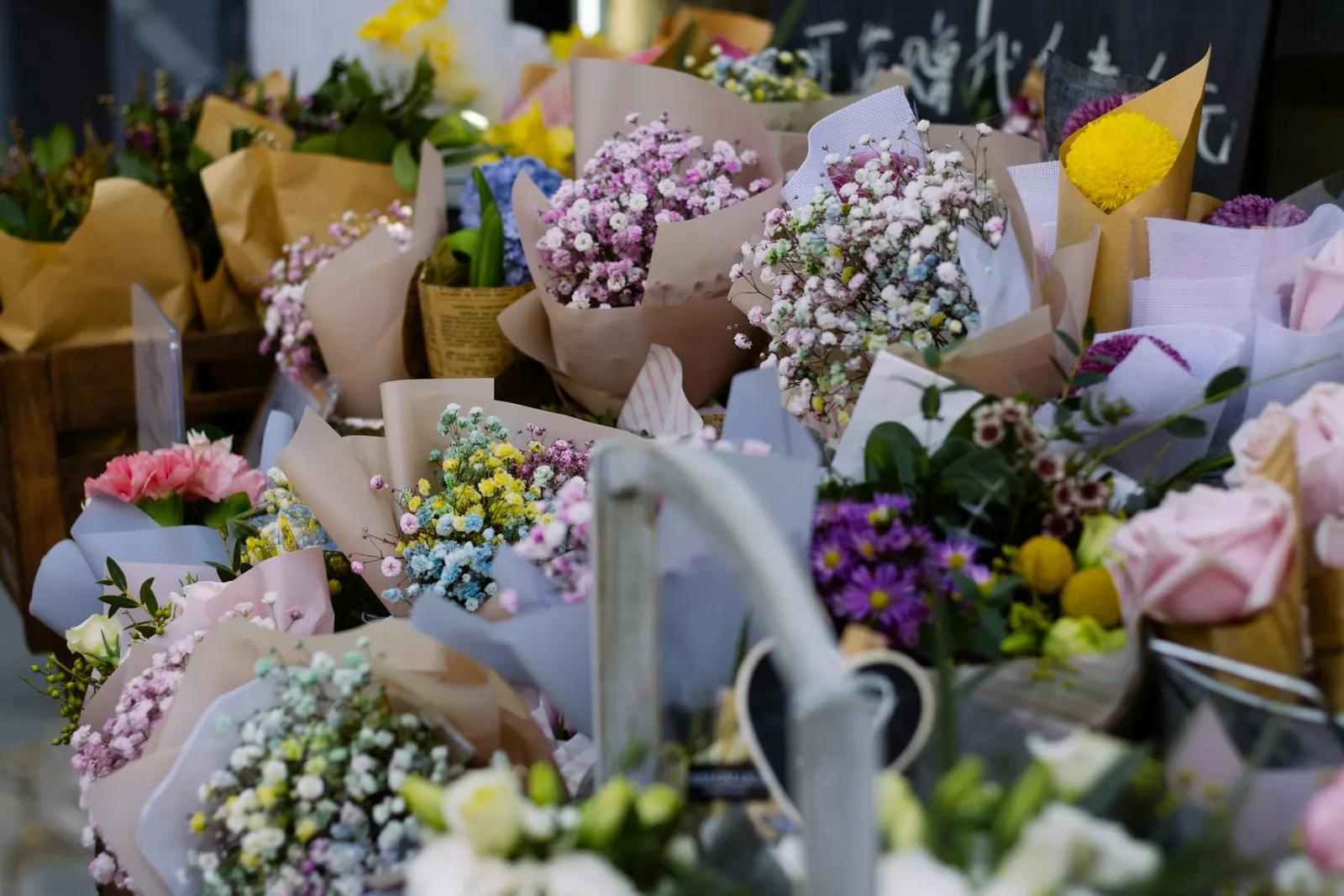
Your secondary color is where your personality shows. This is the pop of interest that makes your bouquet distinctive. We offer ten secondary color options specifically because we have found these are the accent tones that work with the broadest range of weddings.
Here are proven combinations:
With a white primary:
- White + dusty blue — classic, elegant, universally flattering
- White + burgundy — dramatic, romantic, especially strong in fall and winter
- White + sage green — organic, natural, pairs well with Garden and Whimsical styles
- White + lavender — soft, dreamy, beautiful for spring weddings
- White + coral — warm, cheerful, perfect for summer
With a pink/blush primary:
- Blush + burgundy — rich, romantic, incredibly popular for a reason
- Blush + mauve — tonal, sophisticated, photographs beautifully
- Blush + peach — warm, sun-kissed, ideal for outdoor summer weddings
- Blush + cream — subtle, elegant, lets texture do the talking
- Blush + dusty blue — unexpected but gorgeous, a rising combination
Try different pairings in our bouquet customizer to see how they look with your chosen style (Modern, Garden, or Whimsical). Seeing the actual combination is worth more than imagining it.
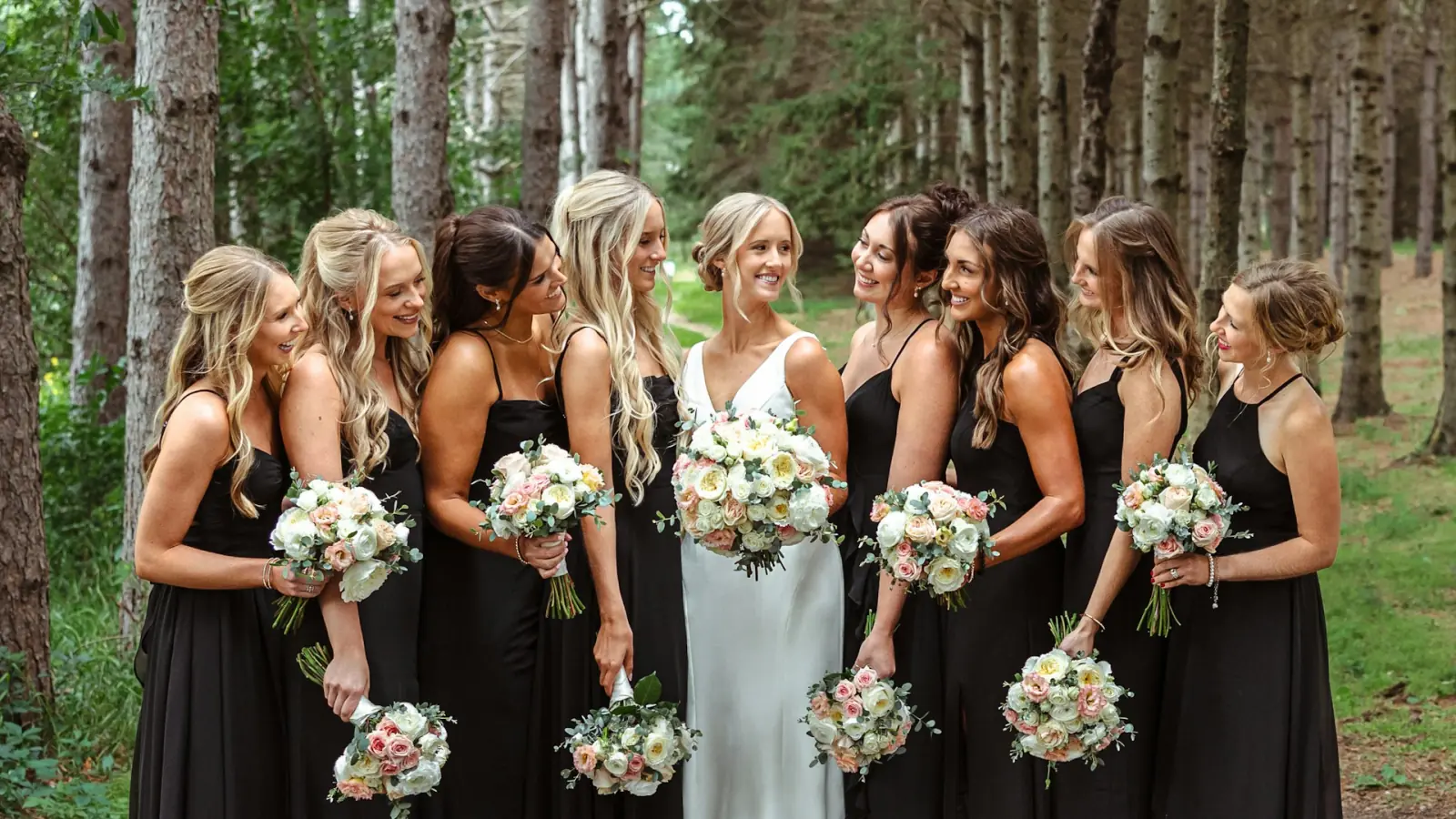
Should Your Bouquet Match Your Bridesmaids' Dresses?
It should complement them, not match them identically. Here is why: if your bridesmaids wear dusty blue and your bouquet is also dusty blue, the flowers can visually disappear against the dresses in photos. A contrasting or complementary bouquet color — blush or white against dusty blue dresses, for example — creates separation and makes both the dresses and the flowers pop.
The best approach is to choose bouquet colors that sit across from or adjacent to the dress color on the color wheel:
- Dusty blue dresses: Blush, peach, or cream bouquets
- Sage green dresses: White, mauve, or soft pink bouquets
- Burgundy dresses: White, blush, or cream bouquets
- Black dresses: White, deep red, or bold jewel-toned bouquets
- Blush dresses: White with a deeper accent (burgundy, plum) or greenery-heavy
How Does Your Bouquet Style Affect Color Choices?
Your bouquet style — Modern, Garden, or Whimsical — influences how your colors read in the final arrangement.
Modern bouquets amplify color contrast. Because the arrangement is structured and clean, each color is distinct and visible. Bold, high-contrast palettes (white and deep burgundy, for instance) look particularly striking in Modern designs. Subtle tonal combinations also work because the clean lines let you appreciate the nuance.
Garden bouquets soften and blend colors. The lush, organic arrangement style means colors flow into each other rather than sitting in sharp contrast. Multi-tonal palettes (blush, peach, and cream) look especially beautiful here because the gradual color shifts feel natural, like an actual garden.
Whimsical bouquets can handle unusual or bold color combinations. The unconventional style gives you permission to pair colors that might feel jarring in a more traditional arrangement — terracotta and sage, mustard and mauve, coral and dusty blue. Read more about each style in our bouquet style guide.
What Colors Photograph Best in Wedding Bouquets?
This matters more than most brides realize. You will look at your wedding photos for decades. Here is what professional photographers consistently report:
Soft, muted tones photograph most reliably. Blush, cream, dusty blue, sage, mauve, and soft peach look beautiful in virtually every lighting condition — golden hour, overcast skies, indoor venues, flash photography.
Bright, saturated colors photograph well but dominate the frame. A hot pink or bright orange bouquet will draw the eye before your face does. That can be intentional and stunning, or it can be distracting. Think about whether you want your bouquet to be a focal point or a complement.
Very dark colors can read as black holes in photos. Deep burgundy and plum are gorgeous in person, but in backlit situations or low light, they can lose all detail and appear as dark masses. If you love dark tones, use them as an accent alongside lighter flowers so there is contrast for the camera to capture.
White bouquets need texture to avoid looking flat. An all-white bouquet is timeless, but without variation in petal shape and texture (mix roses with ranunculus, add textured greenery), it can look like a white blob in photos. Different whites — bright white, cream, and ivory mixed together — add dimension even in a "white" bouquet.
What If You Cannot Decide on Colors?
If you are genuinely stuck, here is a failsafe approach:
- Look at your bridesmaids' dress color. Choose a bouquet primary color that contrasts with it.
- Pick one accent color that you love — not one that "goes" with your wedding, just one that makes you happy when you look at it.
- Add greenery.
That is it. This simple formula produces a bouquet that coordinates with your wedding party, reflects your personal taste, and looks polished without overthinking.
You can also start with our bouquet customizer and simply try every combination until one clicks. Sometimes the right palette is one you would never have considered until you saw it. Learn more about how we source specific colors and check our flower care tips to make sure your chosen colors stay vibrant through the big day.
Color is personal. There is no wrong answer — only the answer that feels right when you imagine yourself walking down the aisle.